The Secret Language of Colors: How Your Favorite Shade Affects Your Mood
Uncover the profound influence of colors on your emotions, behavior, and well-being. Explore how different hues shape your mood and how you can use color to enhance your daily life.
💪 Fitness Guru
45 min read · 26, Feb 2025

Introduction: The Psychology Behind Color
Color is more than just a visual experience; it holds the power to influence our emotions, thoughts, and actions. Whether it’s the calming effect of blue, the energizing vibe of yellow, or the warmth of red, the colors we surround ourselves with have a direct connection to how we feel and behave. This phenomenon is known as color psychology—the study of how colors affect human perception and behavior.
For centuries, people have harnessed the power of color in art, fashion, interior design, and branding. The impact of color isn’t limited to aesthetics; it extends into our emotions, mental states, and even physiological responses. While individual preferences and cultural backgrounds influence how we perceive color, there are some universal associations that are widely understood. For instance, blue is commonly associated with calmness and tranquility, while red is often linked to excitement and passion.
In this article, we will explore how different colors affect our mood and emotions, how we can use them to our advantage, and what the science behind color psychology reveals. Understanding the psychology of color can empower you to create environments that enhance your emotional well-being, improve productivity, and even boost your self-esteem.
The Science of Color Perception
Before diving into the emotional effects of color, it’s important to understand how we perceive color in the first place. The human eye detects colors through photoreceptor cells known as cones, which are sensitive to different wavelengths of light. These wavelengths correspond to specific colors on the visible spectrum, which range from red (longer wavelengths) to violet (shorter wavelengths).
The perception of color also depends on how light interacts with objects. Colors are created by the reflection, absorption, or transmission of light by an object. The surrounding context and the light source can further influence the color we see. This is why a shade of blue might appear different in the morning sunlight than it does under artificial light in the evening.
In addition to physical perception, color also carries psychological and cultural meanings that influence our mood and behavior. This is where the concept of color psychology comes into play. Over time, researchers have found that certain colors evoke particular emotional responses, some of which are instinctive, while others are learned through cultural experiences.
Red: The Color of Passion and Energy
Red is one of the most powerful and stimulating colors in the spectrum. Often associated with passion, excitement, and even danger, red has the ability to provoke strong emotional reactions. It is the color of love and romance, but also of intensity and aggression. It increases heart rate and blood pressure, which is why it’s often used to grab attention or create urgency.
Red and Its Emotional Impact
Psychologically, red is linked to energy, power, and action. It stimulates feelings of excitement, motivation, and confidence. This makes it a popular choice in situations where you need to feel energized or assertive. For example, red is often used in sports team logos, retail sales, and even restaurant decor to encourage action and engagement.
However, red can also evoke feelings of anger, stress, and anxiety when overused. In fact, studies have shown that prolonged exposure to red can lead to feelings of irritation or frustration. This makes it important to use red in moderation and in the right context. In environments that require focus or relaxation, too much red can be overwhelming and counterproductive.
Using Red to Your Advantage
Red can be an excellent color to use when you need a boost of energy or motivation. It can be effective in a home gym, during a workout, or in a creative space where inspiration and action are needed. However, avoid overloading spaces where relaxation and calmness are key, such as bedrooms or meditation areas.
Blue: The Color of Calm and Clarity
Blue is often regarded as the most calming and soothing color. It is linked to feelings of tranquility, trust, and clarity. From the deep blue of the ocean to the light blue of the sky, blue is associated with peace and serenity. Its calming effect makes it one of the most popular colors in interior design and corporate branding.
Blue and Its Emotional Impact
Blue is a color that promotes relaxation and reduces stress. It is often used in spaces where people want to unwind and reflect, such as bedrooms, bathrooms, and spas. Research has shown that blue has a cooling effect on the mind and body, lowering blood pressure and slowing heart rate. This is why blue is often recommended in environments where focus and calmness are needed.
Moreover, blue is also associated with intelligence and trust. It’s a popular choice in professional settings, as it evokes feelings of stability and dependability. That’s why many corporate logos, from banks to tech companies, often incorporate shades of blue to communicate reliability and professionalism.
Using Blue to Your Advantage
Blue is an ideal color for spaces where you need to focus, such as offices or study areas. It is also a great choice for bedrooms or relaxation zones. To maximize the calming effects of blue, consider using lighter, softer shades. Darker blues can sometimes be perceived as cold or distant, so balance is key when incorporating this color.
Yellow: The Color of Optimism and Creativity
Yellow is often considered the happiest color in the spectrum. It is bright, cheerful, and full of energy. Associated with the sun and warmth, yellow can uplift your spirits and boost your mood. It’s no surprise that yellow is often used to evoke feelings of happiness, optimism, and enthusiasm.
Yellow and Its Emotional Impact
Yellow is the color of creativity, innovation, and positivity. It stimulates mental clarity, encourages optimism, and fosters a sense of joy. It is often used in environments where you want to spark creativity or promote positive thinking. This makes yellow a popular color in offices, studios, and educational settings.
However, too much yellow can have the opposite effect. If overused, yellow can become overwhelming and irritating, leading to feelings of frustration or anxiety. This is particularly true with very bright or neon shades of yellow. To prevent overstimulation, it’s best to incorporate yellow in moderation, combining it with more neutral tones.
Using Yellow to Your Advantage
Yellow can be a great color for spaces designed to inspire creativity and enthusiasm, such as art studios or brainstorming rooms. You can also use yellow accents in areas where you want to lift your mood, like kitchens or living rooms. For a calming effect, pair yellow with soft blues or whites to balance its energizing qualities.
Green: The Color of Balance and Growth
Green is often associated with nature, growth, and renewal. It’s the color of plants, forests, and springtime, which makes it a symbol of life and vitality. Green promotes balance, healing, and calmness, making it an ideal color for spaces where you want to restore your energy and create a harmonious environment.
Green and Its Emotional Impact
Psychologically, green is linked to feelings of relaxation, calm, and balance. It is thought to reduce stress and promote feelings of well-being. Green also represents growth, both physical and mental, making it a great color to encourage self-improvement and personal development.
In addition to its calming effects, green can also be associated with wealth, prosperity, and stability. This is why it’s often used in branding for financial institutions or in the design of health and wellness spaces.
Using Green to Your Advantage
Green is an excellent color to incorporate into your home or workplace if you want to create a balanced and restorative environment. It works well in living rooms, bedrooms, and offices where relaxation and focus are key. For a natural look, consider using different shades of green, from soft moss to vibrant emerald, depending on the mood you wish to create.
The Influence of Colors on Personal Identity and Cultural Associations
Colors are not only tied to personal emotional responses, but they also carry cultural significance. Different cultures around the world associate certain colors with specific meanings. For example, in many Western cultures, white symbolizes purity and peace, while in some Eastern cultures, it is associated with mourning and death. Similarly, red can symbolize luck and prosperity in Chinese culture, while it represents danger or warning in Western contexts.
These cultural influences can also affect how we respond to colors. Understanding these associations is crucial when using colors for branding, marketing, or designing spaces for a diverse audience.
Purple: The Color of Luxury and Spirituality
Purple has long been associated with royalty, luxury, and spirituality. Historically, purple dyes were rare and expensive, making them accessible only to the wealthy and powerful. This legacy has helped establish purple as a color linked to prestige, wealth, and status. But beyond its regal associations, purple also carries a more introspective, spiritual significance.
Purple and Its Emotional Impact
Purple is considered a color of balance and creativity. It blends the calm stability of blue with the energy of red, creating a unique dynamic that can evoke a sense of both calm and stimulation. It is often associated with creativity and artistic expression, making it a favored color in creative industries and environments designed to foster inspiration.
Psychologically, purple is said to promote a sense of inner peace and spiritual awareness. It encourages contemplation, mindfulness, and an openness to new ideas. This is why purple is often used in spaces dedicated to meditation, relaxation, or personal growth.
However, purple can also be seen as a mysterious or even melancholic color, especially in darker shades. It’s important to use purple thoughtfully, as too much of it can create an air of detachment or solitude.
Using Purple to Your Advantage
Purple can be an excellent choice for spaces where creativity, reflection, and introspection are important, such as art studios, libraries, or personal study areas. Lighter shades of lavender or lilac can promote calmness and relaxation, while deeper shades like violet or plum can evoke a more dramatic or luxurious atmosphere. When paired with softer colors like cream or soft green, purple can be both energizing and soothing.
Orange: The Color of Warmth and Enthusiasm
Orange, a vibrant blend of red and yellow, is a color of warmth, enthusiasm, and energy. It radiates positivity and is often associated with fun, creativity, and social interaction. Unlike the intense passion of red, orange strikes a more playful and approachable tone, making it ideal for environments designed to stimulate conversation and collaboration.
Orange and Its Emotional Impact
Orange is a color that promotes feelings of excitement and energy, making it a great choice for social spaces like dining rooms, cafes, or communal areas. It is believed to encourage creativity and spontaneity, which is why it’s often used in workspaces or brainstorming areas where fresh ideas are needed.
In addition to its energetic qualities, orange is also seen as a symbol of warmth and friendliness. It invokes feelings of optimism and joy, but it’s important to strike the right balance—too much orange can be overstimulating and may even lead to feelings of agitation.
Using Orange to Your Advantage
Orange can be a great accent color to incorporate in areas where interaction and communication are key, such as living rooms, kitchens, or creative workspaces. To avoid overwhelming the senses, use orange in moderation, such as in accent walls, artwork, or throw pillows. Pair it with neutral tones like gray or beige to balance its vibrant energy.
The Role of Light and Shade in Color Perception
It’s crucial to remember that the way we perceive color is influenced not only by the color itself but also by the lighting and shading in a given space. Natural light brings out the true tones of a color, while artificial light can significantly alter the hue and mood of a room. The intensity of light, whether it’s warm, cool, or neutral, can also impact how colors make us feel.
How Light Affects Colors
Warm light tends to enhance the red, yellow, and orange hues, creating a cozy, inviting atmosphere, while cool light can bring out the cooler tones, such as blues, greens, and purples. For instance, soft white or yellow lighting can make a red room feel more intimate and welcoming, whereas bright, cool white lighting can make the same red room feel more intense or stimulating.
The texture and finish of the color you choose also play a role. Glossy or metallic finishes reflect more light, which can make a color appear brighter and more intense. Matte finishes absorb light, giving colors a softer, more muted look. When designing a space, it’s essential to consider both the color and the lighting to achieve the desired emotional effect.
Conclusion
Colors have a powerful influence on our emotions, behaviors, and overall well-being. From the calming nature of blue to the energizing power of red, every hue carries a unique psychological impact that can help shape how we experience the world around us. By understanding the subtle effects of colors, we can harness their power to create environments that enhance mood, stimulate creativity, promote relaxation, or foster productivity.
Whether you're designing a space, choosing an outfit, or selecting colors for a brand, it's important to consider how the colors you surround yourself with will affect your mental and emotional state. Colors are not just an aesthetic choice—they are tools that can influence how we feel, think, and even interact with others. For example, warm colors like orange and yellow can bring a sense of warmth and optimism, while cool colors like green and blue can bring calm and tranquility.
By making conscious choices about color in our environment, we can enhance our mental well-being, boost productivity, and create spaces that foster positive emotions. However, it's also important to remember that personal preferences, cultural associations, and lighting conditions play a role in how we perceive color, so finding the right balance is key.
The secret language of colors offers us the opportunity to align our surroundings with our emotional and psychological needs. Understanding and applying color psychology in everyday life is a simple yet effective way to improve mood, encourage creativity, and even enhance communication. Whether you seek relaxation, focus, or joy, the colors around you can guide your experience, ultimately contributing to a better, more fulfilling life.
Q&A Section
1. What is color psychology?
Color psychology is the study of how different colors can influence human emotions, behavior, and decision-making. It’s based on the idea that colors evoke specific feelings and mental responses.
2. How does the color red affect emotions?
Red is an intense color that can increase heart rate and stimulate excitement, passion, and energy. It is often linked to strong emotions such as love, anger, and urgency.
3. Why is blue considered calming?
Blue is associated with tranquility, peace, and stability. It has a cooling effect on the mind and body, lowering heart rate and promoting relaxation. It’s often used in spaces meant for focus or unwinding.
4. Can colors affect productivity?
Yes! Certain colors can boost productivity by either energizing or calming the mind. For instance, yellow is thought to encourage creativity, while blue and green foster focus and balance.
5. What mood does yellow evoke?
Yellow is a bright and cheerful color associated with happiness, optimism, and creativity. It stimulates mental clarity and can boost mood, making it ideal for spaces where positivity is needed.
6. Is green good for relaxation?
Yes, green is known for its calming and balancing properties. It is often linked to nature, growth, and renewal, making it a great choice for spaces where relaxation and healing are important.
7. How do personal preferences affect our response to color?
Individual preferences, cultural influences, and personal experiences all impact how we respond to color. For example, someone might prefer blue for its calming effect, while another might feel more energized by red.
8. Are there colors to avoid in a bedroom?
Bright or intense colors like red or orange can be stimulating and may disrupt sleep. Softer, cooler colors like blue, lavender, or green are generally better suited for a restful bedroom environment.
9. How does the lighting affect the perception of colors?
Lighting can significantly alter how a color appears. Warm lighting enhances reds, yellows, and oranges, creating a cozy atmosphere, while cooler lighting can bring out blues and greens, promoting calmness.
10. Can colors influence consumer behavior?
Yes, brands use color strategically to evoke specific emotions and behaviors. For example, red and yellow are used in fast food logos to stimulate hunger and excitement, while blue conveys trust and reliability in corporate settings.
Similar Articles
Find more relatable content in similar Articles
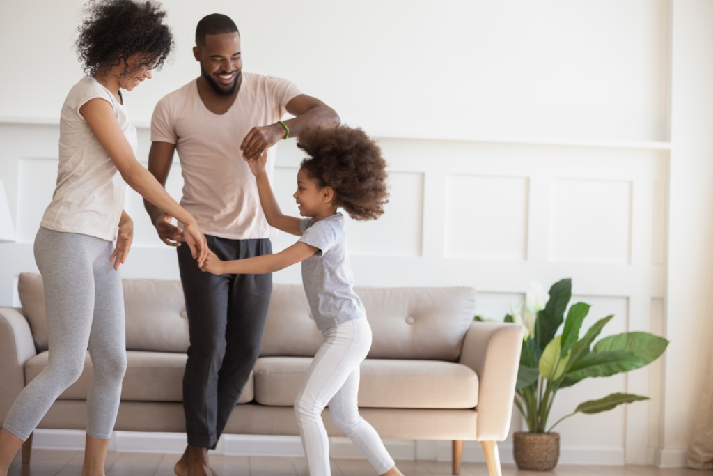
Parenting and Fitness: Turning Playtime Into Workouts...
Discover how parents can seaml.. Read More

Anti-Aging on a Plate: Foods That Keep Your Skin Youthful an..
What you eat reflects on your.. Read More
The Skin-Food Connection: What to Eat for Acne-Free, Radiant..
What you eat directly shapes .. Read More
Eco-Fitness: Training While Helping the Environment...
Eco-Fitness is a transformativ.. Read More
© 2024 Copyrights by rFitness. All Rights Reserved.