The Power of Color: How to Use Color Psychology to Transform Your Mood and Spaces
Explore how the colors around you influence your emotions, energy, and behavior, and learn practical ways to harness color psychology to elevate your personal space and mindset.
💪 Fitness Guru
48 min read · 10, Mar 2025

Introduction: The Hidden Influence of Color
Color is everywhere, from the clothes we wear to the walls in our homes and the logos we see daily. It plays a significant role in shaping our environment and influencing our feelings, perceptions, and behaviors. We may not always be aware of it, but color has a powerful psychological impact on our emotions and actions.
Color psychology is the study of how different colors affect human behavior, mood, and even physical responses. Whether it’s the calming effect of blue or the energizing power of yellow, the right colors can uplift our spirits, promote productivity, and even improve our overall well-being.
In this article, we’ll explore the fundamentals of color psychology and how you can use color to create more balanced, vibrant spaces and improve your mood. By understanding how different hues affect us emotionally and mentally, you can transform your living or working environment, enhance your productivity, and foster a more positive mindset.
The Science Behind Color Psychology
Before diving into how to use color in practical ways, it’s essential to understand the science behind color psychology. How do colors affect our mood and behavior?
Color and the Brain
Color doesn’t just sit passively in our environment; it actively stimulates our brain. When we see a color, light waves hit the retina, sending signals to the brain that trigger various emotional and psychological responses. For example, red is often associated with energy and excitement because it stimulates the sympathetic nervous system, which is responsible for the “fight or flight” response.
The way we perceive colors is not just culturally determined; it’s rooted in biology. Over time, certain colors have come to represent particular emotions or actions based on evolutionary processes. For instance, green, associated with nature and growth, has calming and balancing effects because it signals safety and renewal.
Cultural Influences on Color Perception
While there are universal associations with certain colors, cultural influences also play a significant role in how we interpret them. For instance, in many Western cultures, black is associated with mourning and grief, while in some Eastern cultures, it symbolizes power and formality. Similarly, white can be associated with purity in many cultures, while in others, it represents mourning.
These cultural nuances mean that while color can have a universal impact, its significance might differ based on where you are in the world. Understanding the cultural context of color is essential when considering how to use it in design and personal spaces.
The Psychological Impact of Color
Various studies have shown that different colors can influence our emotions, stress levels, and even our appetite. For example, blue is known to lower blood pressure and promote calmness, making it ideal for bedrooms or areas where you want to relax. On the other hand, red is energizing and stimulating, often used in spaces where focus or action is required.
Here are some key ways that colors impact us psychologically:
- Red: Associated with passion, excitement, and urgency. It increases energy levels and can elevate heart rates.
- Blue: Known for its calming effects, blue promotes tranquility, focus, and productivity. It’s a great choice for workspaces or bedrooms.
- Yellow: Symbolizes happiness, optimism, and creativity. Yellow is a great color for kitchens and areas where you want to promote energy and focus.
- Green: Represents nature, growth, and balance. It’s soothing and relaxing, making it an excellent choice for living rooms or spaces meant for relaxation.
- Purple: Linked with luxury, creativity, and spirituality. Purple can inspire creativity and calmness in spaces dedicated to personal reflection.
- Orange: Energetic and lively, orange promotes enthusiasm and social interaction. It’s often used in spaces meant for gatherings or entertainment.
- White: Symbolizing cleanliness, purity, and simplicity, white can open up small spaces and create a feeling of freshness and calm.
- Black: Often associated with sophistication, power, and elegance, black is a bold color that can add depth and drama to a space.
- Pink: Known for its calming and nurturing effects, pink is often used to promote feelings of care and softness.
How to Use Color Psychology to Transform Your Mood
Now that we’ve understood the science behind color psychology, let’s explore how to use color strategically to improve your mood and overall well-being.
Choosing Colors for Different Moods
One of the most powerful ways to influence your emotions is through the colors you surround yourself with. Here’s how to select colors based on the mood you want to create:
For Calm and Relaxation:
If you’re looking to create a peaceful, stress-free environment, opt for colors that promote tranquility and relaxation. Soft blues, gentle greens, and lavender are great choices. These colors are known to lower blood pressure and promote a sense of calm.
- Blue: Light or muted shades of blue create a calming effect and are ideal for bedrooms or areas meant for unwinding.
- Green: A versatile color that’s associated with nature, green is soothing and helps balance emotions. Use it in your living room or home office.
- Lavender: A soft, muted purple, lavender is associated with calmness and spirituality. It’s great for meditation spaces or bedrooms.
For Energy and Motivation:
If you need a burst of energy or motivation, opt for brighter, more vibrant colors that stimulate the senses. Red, orange, and yellow are perfect for promoting action and positivity.
- Red: If you want to feel energized, passionate, or motivated, incorporate red into your space. It’s ideal for a home office or gym.
- Yellow: Known as the color of optimism, yellow is perfect for sparking creativity and promoting a cheerful atmosphere.
- Orange: If you want to create an upbeat, social environment, orange is a perfect choice. It’s an energetic color that encourages interaction.
For Focus and Clarity:
Certain colors can help you concentrate and increase mental clarity. Soft, muted tones like green, beige, and light gray are excellent for creating a space conducive to focus.
- Green: A restful color that promotes focus and reduces anxiety, green is an excellent choice for study rooms or home offices.
- Beige: Neutral tones like beige or light taupe can create a serene environment without distractions, perfect for workspaces.
- Light Gray: This color creates a minimalist vibe that promotes concentration and calmness.
For Creativity and Inspiration:
To stimulate your creative mind, surround yourself with colors that encourage imaginative thinking. Purple, yellow, and blue are great for promoting creativity.
- Purple: As a color associated with creativity and spirituality, purple can help enhance artistic thinking.
- Yellow: Stimulating creativity and inspiring optimism, yellow is ideal for spaces where you engage in creative activities.
- Blue: Light blue can also be an excellent color for stimulating creative thoughts while maintaining a sense of calm.
How to Use Color to Transform Your Living Spaces
Incorporating color psychology into your living environment is a powerful way to change your mood, boost productivity, and create a space that reflects your needs. Here are some practical ways to use color in your home to transform the way you feel.
1. Color Palette for Different Rooms
Each room in your home serves a different purpose, and choosing the right color palette for each can have a significant impact on the atmosphere you create.
- Living Room: The living room is a space for relaxation and socializing, so opt for colors that foster a welcoming, calm atmosphere. Soft blues, warm greens, and neutrals are excellent choices.
- Kitchen: The kitchen is often a hub of activity, and vibrant colors like yellow, orange, and red can stimulate appetite and encourage energy. However, it’s best to keep these colors in moderation to avoid overwhelming the space.
- Bedroom: To create a restful retreat, choose soothing colors like soft blues, greens, or lavender. Avoid bold or energetic colors like red or bright yellow, which can disrupt sleep.
- Home Office: For focus and productivity, use calming colors like soft greens, blues, and neutrals. These tones promote clarity without being too stimulating.
- Bathroom: White, light blue, and soft greens are perfect for creating a clean, refreshing atmosphere. These colors make small spaces feel bigger and are ideal for areas where you want to relax.
2. Use Accent Colors
You don’t need to paint an entire room a single color to use color psychology effectively. Incorporating accent colors in smaller doses—through furniture, accessories, or artwork—can transform the mood of the room without overwhelming it.
For example, adding a bright red throw pillow or a yellow vase can inject a pop of energy into a neutral-colored room. Similarly, a calming green rug or lavender curtains can add tranquility to a space.
3. Lighting and Color
Lighting can significantly affect how colors appear in a room and how they influence your mood. Natural light enhances colors, making them appear more vibrant, while artificial light can cast warmer or cooler tones. To get the most out of your color choices, consider the type of lighting in your space and how it interacts with the color palette you select.
Color Trends in Interior Design and Their Psychological Impact
In recent years, color trends have evolved to reflect societal moods and shifting cultural values. From the warm, earthy tones of recent years to the return of vibrant hues, these trends are deeply intertwined with how we are feeling as a society. Let’s explore how some of the current trends in interior design align with color psychology.
Earth Tones and Natural Colors
With a growing focus on sustainability and environmental consciousness, natural colors such as deep greens, browns, and ochre have surged in popularity. These colors connect us with the outdoors and evoke a sense of calm, grounding, and connection to nature. They are often used to create cozy, nurturing spaces where people can feel safe and secure.
- Psychological Effect: Earth tones are grounding, making them perfect for spaces meant for rest and reflection, such as bedrooms and living rooms.
- Popular Combinations: Green with brown, terracotta with cream, or mustard yellow with forest green.
Vibrant Colors for Creativity and Energy
As remote work and the focus on personal creativity grow, vibrant hues like bold oranges, electric blues, and neon pinks have found their way into home offices and creative spaces. These colors boost energy levels and mental stimulation, making them ideal for spaces where you want to feel motivated, inspired, or productive.
- Psychological Effect: Bright, bold colors stimulate the brain and can promote creativity and action.
- Popular Combinations: Neon pink with turquoise, orange with cobalt blue, or lime green with vivid yellow.
Pastels for Calm and Serenity
The calming influence of pastels remains a strong trend, especially in bedrooms, bathrooms, and wellness spaces. Soft pinks, blues, and lilacs are known for their soothing qualities, providing the perfect backdrop for relaxation and mindfulness practices. These colors work well in environments where reducing stress and anxiety is the main goal.
- Psychological Effect: Pastels are peaceful and gentle, promoting emotional healing and tranquility.
- Popular Combinations: Lavender with soft gray, light mint with pale peach, or soft yellow with pale lavender.
Monochrome and Minimalist Designs
Monochromatic color schemes—using variations of a single color—have been popular in both modern and minimalist designs. This trend allows for a space that feels cohesive and unified. The single color creates a calming atmosphere without being overwhelming. Minimalist designs, often paired with sleek furniture and clean lines, allow the color to be the primary focus of the space.
- Psychological Effect: Monochrome designs provide harmony and balance, reducing visual distractions and promoting clarity of thought.
- Popular Combinations: Various shades of gray, or muted tones of blue and beige.
Practical Tips for Experimenting with Color
If you’re ready to incorporate color psychology into your living spaces, here are some practical tips to get started:
1. Start with Accent Walls
One of the easiest ways to experiment with color in your home is by adding an accent wall. This allows you to use a bolder color in a single area of the room without committing to painting the entire space. Accent walls work well in living rooms, bedrooms, or home offices, where you can bring in a vibrant color without overwhelming the room. For example, a bold red accent wall in a neutral-toned living room can create energy and focus, while a soft blue accent wall in a bedroom can promote calm and relaxation.
2. Color Your Furniture
If painting walls seems like too much of a commitment, consider adding color through your furniture. Bold-colored sofas, chairs, or even throw pillows can introduce color without being permanent. Choose a color that aligns with the mood you want to create—perhaps a calming green for a peaceful environment or a cheerful yellow for an uplifting vibe. Don’t forget about rugs, curtains, and artwork as additional opportunities to incorporate color.
3. Use Color in Smaller Decor Items
If you're hesitant to make big changes, start small with décor items like lamps, vases, or picture frames. For instance, if you want to create a sense of calm, choose soft blue accessories for your home office. If you want to feel more energized, opt for bright orange or yellow items. These small tweaks can help you understand how different colors make you feel before committing to larger changes.
4. Create a Color Calendar
Experimenting with color doesn’t have to be a one-time event. Consider a color calendar where you switch out accent pieces or wall décor monthly or seasonally. For example, use calming colors like blue and green in the winter months, and then switch to brighter colors like yellow or orange for the summer. This can allow you to adjust your environment in response to both seasonal changes and your personal mood.
5. Use Natural Light to Your Advantage
Color can look drastically different depending on the lighting in your space. Natural light can make colors appear brighter and more vibrant, while artificial lighting can affect how colors are perceived. Before finalizing a color choice, make sure to test it in various lighting conditions. Try painting a small area and observing it during different times of the day to see how the light changes the tone.
Conclusion
Color psychology offers an incredibly powerful tool to influence your mood, productivity, and the way you experience your environment. Whether you are designing a new space or simply want to improve the energy of your home, understanding the psychological effects of color can transform the way you live and work.
By choosing the right colors for the right spaces and pairing them thoughtfully, you can create a home or office that reflects your needs and aspirations. Use color to create calm and tranquility when needed, boost creativity and motivation in workspaces, or simply refresh your surroundings with colors that inspire and uplift.
The ability to harness color psychology is an accessible and cost-effective way to enhance your life. As you experiment with different hues and combinations, you’ll start to notice how color can subtly—yet powerfully—shape your experiences and emotions.
Q&A
Q: How can color psychology impact my mood?
A: Color psychology affects our emotional states because colors evoke specific feelings. For example, blue promotes calmness, while yellow increases energy. By surrounding yourself with colors that align with your desired mood, you can influence how you feel and act.
Q: What color is best for a productive workspace?
A: Blue and green are ideal colors for productivity because they promote focus, calmness, and mental clarity. Blue enhances concentration, while green provides a soothing, balanced atmosphere.
Q: How do warm colors like red and orange affect my environment?
A: Warm colors like red and orange are energizing and stimulating. They encourage action, creativity, and social interaction, making them great for areas like kitchens or creative workspaces. However, too much of these colors can cause restlessness.
Q: Can colors in my home affect my sleep?
A: Yes, colors in your bedroom can impact your ability to sleep. Soft blues, greens, and neutral tones create a calming environment, while brighter colors, such as red or yellow, can make it harder to unwind and fall asleep.
Q: What is the effect of using pastel colors in a room?
A: Pastel colors are gentle, soothing, and calming. Soft pinks, blues, and greens are perfect for spaces meant for relaxation and rejuvenation, such as bedrooms or bathrooms.
Q: How do colors influence our decision-making?
A: Colors can impact our decisions by evoking subconscious responses. For example, green is often associated with calm and trust, making it a popular color in business settings. Red, on the other hand, is a color of urgency, which is why it's often used in call-to-action buttons.
Q: Can color combinations influence the perception of space?
A: Yes, color combinations can alter the perception of a room’s size and atmosphere. Light colors like whites and pastels make a space feel larger and more open, while darker shades can make it feel more intimate or cozy.
Q: Should I use the same color throughout my home?
A: While it's possible to use a consistent color palette, each room can benefit from unique colors based on its purpose. For example, you might use calming colors in the bedroom, while opting for stimulating colors in the kitchen or office.
Q: How do I choose the right color for a specific room?
A: When choosing colors for a room, consider the room’s purpose. For relaxation, go for cool or neutral tones. For energizing spaces like kitchens, bright, warm colors may work better. Also, consider the amount of natural light the room receives.
Q: Can I change my color choices over time?
A: Absolutely! Color preferences can evolve, and so can your environment. Experiment with new hues and adjust as your needs and tastes change. You can refresh a room by swapping out accent colors or changing your décor.
Similar Articles
Find more relatable content in similar Articles
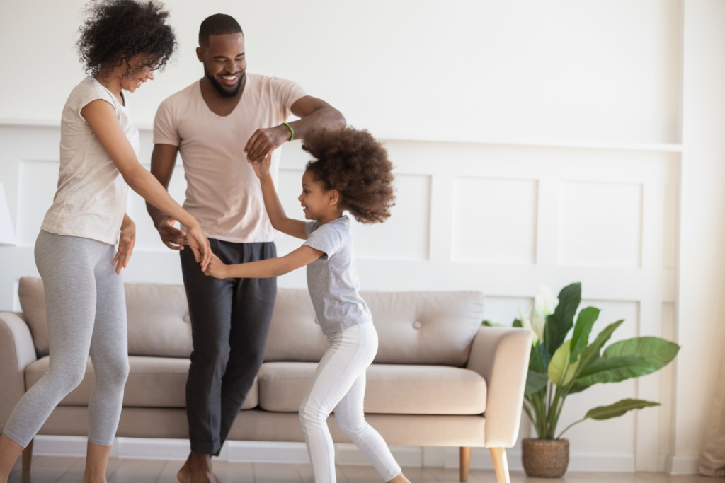
Parenting and Fitness: Turning Playtime Into Workouts...
Discover how parents can seaml.. Read More
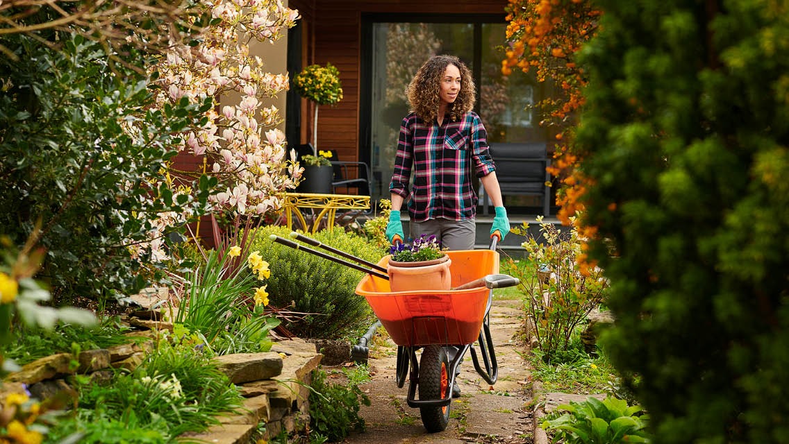
How Gardening Counts as a Full-Body Workout...
“Discover how gardening goes b.. Read More
Eco-Fitness: Training While Helping the Environment...
Eco-Fitness is a transformativ.. Read More
Fitness on a Budget – Training With Household Items...
Transform your home into a ful.. Read More
© 2024 Copyrights by rFitness. All Rights Reserved.